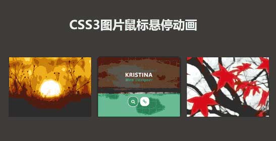
css3响应式图片列表布局,鼠标悬停图片遮罩层显示文字和图标动画特效。
[声明] 墨鱼部落格所有资源为用户免费分享产生,若发现您的权利被侵害,请点击后方链接查看并联系我们,我们尽快处理。免责声明|侵权处理流程
使用方法:
1、head引入css文件
<!--bootstrap布局框架-->
<link rel="stylesheet" type="text/css" href="css/bootstrap-grid.min.css" />

<!--字体图标样式-->
<link rel="stylesheet" type="text/css" href="https://cdn.bootcss.com/font-awesome/4.6.0/css/font-awesome.min.css">

<style>
body{background-color: #353535}
.box {
	font-family: 'Ubuntu', sans-serif;
	overflow: hidden;
	position: relative;
	transition: all 0.3s;
}
.box:hover {
	box-shadow: 0 0 15px -5px #000;
}
.box:before {
	content: '';
	background-color: transparent;
	background-image: radial-gradient(circle at 20% 80%, transparent 29%, rgba(255,255,255,0.4) 30%, rgba(255,255,255,0.4) 33%, transparent 34%),  radial-gradient(circle at 80% 20%, transparent 29%, rgba(255,255,255,0.4) 30%, rgba(255,255,255,0.4) 33%, transparent 34%);
	background-size: 30px 30px;
	height: 100%;
	width: 100%;
	opacity: 0;
	position: absolute;
	left: 0;
	top: 0;
	z-index: 1;
	transition: all 0.3s ease 0.2s;
}
.box:hover:before {
	opacity: 1;
}
.box img {
	width: 100%;
	height: auto;
	transition: all 0.3s ease 0s;
}
.box:hover img {
	filter: blur(2px);
}
.box .box-content {
	color: #fff;
	background-color: rgba(0,0,0,0.6);
	text-align: center;
	width: 100%;
	height: 59%;
	padding: 18% 0 0 0;
	position: absolute;
	left: 0;
	top: -100%;
	z-index: 2;
	transition: all 0.3s ease 0s;
}
.box:hover .box-content {
	top: 0;
}
.box .title {
	color: #fff;
	font-size: 23px;
	font-weight: 600;
	letter-spacing: 1px;
	text-transform: uppercase;
	margin: 0;
}
.box .post {
	color: #32c287;
	font-size: 14px;
	font-style: italic;
	text-transform: capitalize;
	letter-spacing: 2px;
}
.box .icon {
	background: rgba(50,194,135,0.6);
	text-align: center;
	height: 39%;
	width: 100%;
	padding: 15px 0 0;
	margin: 0;
	list-style: none;
	transform: translateX(50%);
	position: absolute;
	right: 50%;
	bottom: -100%;
	z-index: 1;
	transition: all 0.3s;
}
.box:hover .icon {
	bottom: 0;
}
.box .icon li {
	display: inline-block;
	margin: 0 3px;
}
.box .icon li a {
	color: #32c287;
	background-color: #fff;
	font-size: 18px;
	line-height: 40px;
	height: 40px;
	width: 40px;
	border-radius: 40%;
	display: block;
	transition: all 0.3s;
}
.box .icon li a:hover {
	color: #fff;
	background-color: #04a562;
	box-shadow: 0 0 0 3px rgba(255,255,255,0.5), 0 0 5px rgba(0,0,0,0.5) inset;
}

@media only screen and (max-width:990px) {
.box {
	margin-bottom: 30px;
}
}

@media only screen and (max-width:479px) {
.box .title {
	font-size: 20px;
}
}
</style>
2、body引入HTML代码
<div class="demo">
	<div class="container">
		<div class="row">

			<div class="col-md-4 col-sm-6">
				<div class="box">
					<img src="images/img-1.jpg" alt="">
					<div class="box-content">
						<h3 class="title">Williamson</h3>
						<span class="post">web developer</span>
					</div>
					<ul class="icon">
						<li><a href="#"><i class="fa fa-search"></i></a></li>
						<li><a href="#"><i class="fa fa-link"></i></a></li>
					</ul>
				</div>
			</div>

			<div class="col-md-4 col-sm-6">
				<div class="box">
					<img src="images/img-2.jpg" alt="">
					<div class="box-content">
						<h3 class="title">Kristina</h3>
						<span class="post">web designer</span>
					</div>
					<ul class="icon">
						<li><a href="#"><i class="fa fa-search"></i></a></li>
						<li><a href="#"><i class="fa fa-link"></i></a></li>
					</ul>
				</div>
			</div>

			<div class="col-md-4 col-sm-6">
				<div class="box">
					<img src="images/img-3.jpg" alt="">
					<div class="box-content">
						<h3 class="title">Miranda Roy</h3>
						<span class="post">web developer</span>
					</div>
					<ul class="icon">
						<li><a href="#"><i class="fa fa-search"></i></a></li>
						<li><a href="#"><i class="fa fa-link"></i></a></li>
					</ul>
				</div>
			</div>

		</div>
	</div>
</div>
文件目录

本资源来自:代码 » css3实例 » css3列表图片悬停动画特效
注:此资源非帝国CMS模板/特效/源码,需要帝国CMS整站模板源码的小伙伴,请移步 帝国CMS模板,感谢支持!
js css3卡通人物表情动画特效
« 上一篇
2019年03月25日
js css3交互式圆形菜单代码
下一篇 »
2019年02月28日
1、如非特殊说明,本站对本文提供的代码或者素材不拥有任何权利,其版权归原著者拥有。
2、以上提供的代码或者素材均为作者提供和网友推荐收集整理而来,仅供学习和研究使用。
3、如有侵犯你版权的,请来信(邮箱:48444431@qq.com)指出,核实后,本站将立即改正。
4、如有链接无法下载、失效或广告,请点击下面的报错或者联系墨鱼处理!
5、以上资源售价只是赞助,不代表代码或者素材本身价格。收取费用仅维持本站的服务器开销!
6、如无特殊说明,如:织梦或者帝国等开源CMS核心模板,那么默认提供的只是HTML模板!
7、所有代码素材效果均为演示打包,最终效果请参考演示效果,本站不提供任何技术支持和服务。
8、代码素材均为虚拟物品,演示和描述无错的情况下,无法进行退换服务。
2、以上提供的代码或者素材均为作者提供和网友推荐收集整理而来,仅供学习和研究使用。
3、如有侵犯你版权的,请来信(邮箱:48444431@qq.com)指出,核实后,本站将立即改正。
4、如有链接无法下载、失效或广告,请点击下面的报错或者联系墨鱼处理!
5、以上资源售价只是赞助,不代表代码或者素材本身价格。收取费用仅维持本站的服务器开销!
6、如无特殊说明,如:织梦或者帝国等开源CMS核心模板,那么默认提供的只是HTML模板!
7、所有代码素材效果均为演示打包,最终效果请参考演示效果,本站不提供任何技术支持和服务。
8、代码素材均为虚拟物品,演示和描述无错的情况下,无法进行退换服务。